Introduction

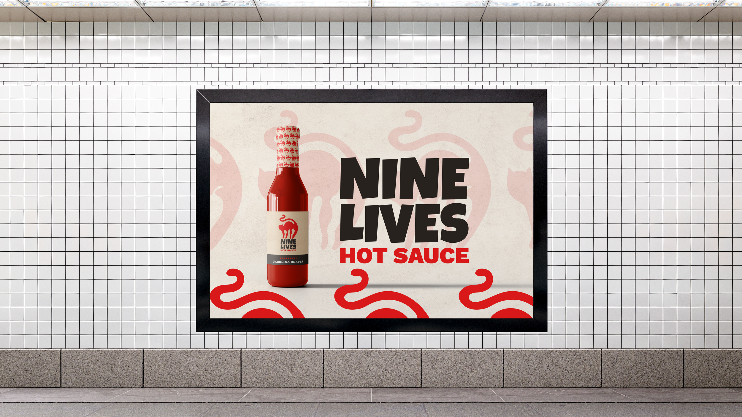
Nine Lives Hot Sauce needed packaging and a logo that would stand out on shelves while embodying its playful yet intense personality. The challenge was to create a visual identity that felt as dynamic, fiery, and layered as the sauce itself.


Role

Graphic Designer

Services

Brand Identity Design
Packaging Design

Deliverables

Logo
Bottle Label Design
Brand Assets and Mock ups

Logo Exploration

During the design process, I explored various ways to incorporate peppers into the logo using negative space. I experimented with different placements and shapes of the peppers to ensure they felt natural within the cat’s form while reinforcing the brand’s fiery essence.

Logo Design

The final logo design features a bold, fiery red cat, embodying the brand’s playful yet fierce personality. Additionally, the cat’s stance and flowing lines give the impression that it’s stepping on a hot surface, further emphasizing the fiery nature of the brand.

Color palette

The color palette for Nine Lives Hot Sauce is inspired by the heat levels of the peppers used in each sauce. Green represents jalapeño, yellow symbolizes habanero, and red signifies the intense heat of the Carolina Reaper. 


To balance the bold colors, I chose a warm beige background for the labels, giving them a slightly rustic, handcrafted feel while ensuring the text and graphics remain clear and legible.